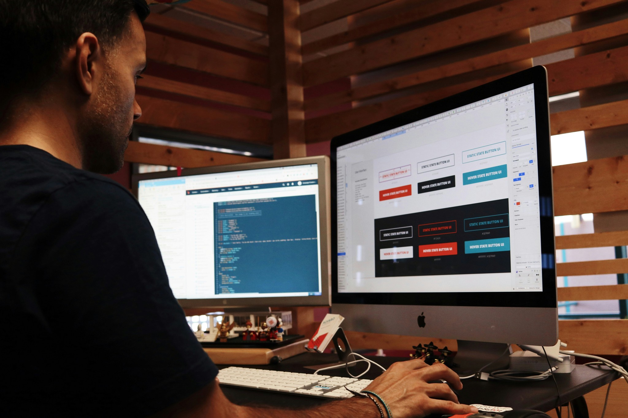
Crafting a Dynamic Navigation Component Using Variables
Crafting a Dynamic Navigation Component Using Variables
As the internet continues to develop and grow exponentially, jobs related to the industry do too.

David Brown
5
min read
February 6, 2022


Navigation is key within any digital interface. Smart Components enable us to create custom interactive navigation components that work perfectly with the rest of your prototype.In this guide, we will cover the concepts of nesting components, adding events to elements in a component using Event Variables, and passing these through your components. One of the main benefits of using nested components is that it provides full control over its states, such as unique hover states of elements within another component.
Starting at the atomic level
Framer allows you to create fully interactive and animated components, and even allows you to nest components within other components. We’re building a navigation bar component for a website that will contain two different kinds of nested components, with their own unique interactions. Our project will contain a Navigation bar that contains various nested components, namely five Nav items and one Shopping cart component. The design of our nested components, the nav list item and the shopping cart, will impact how we design our navigation bar. For this reason, an optimal workflow includes starting with the 'deepest' nested component and building up from there.
Nesting components
Once we have our two components ready, we can start creating the component in which we will nest these. Draw your navigation bar, select it on the canvas and click the Component tool in the Toolbar. To nest a different component in our new component, just drag any other component to the Component Canvas and place it within your designed navigation bar.
Triggering interactions from the navigation bar
Back on the main canvas, we’d like to be able to tap 'Clothing' and navigate to an entire new Screen. If you’d connect the component using the Prototyping Connector to a new screen, we could set up an Interaction. However, this would be triggered if we tap anywhere within our component. This isn’t what we want to do, as we want to trigger this transition only from a specific element. This is where Event Variables come in, which are special types of Variables not attached to properties (like opacity or fill) but instead to events.
Other blog articles
Recommended Articles
Explore Our FAQs
Find quick answers to commonly asked questions about Dashcraft. Have a question not listed?
DashCraft's key features?
How does DashCraft simplify web development?
Can I customize web apps with DashCraft?
Does DashCraft support data integration?
Suitable for businesses of all sizes?
How quickly can I create a web app?
What support options does DashCraft offer?

Launch an app in one sitting
Develop web apps quickly with Dashcraft - the developer-friendly low-code web app builder designed for speed.
Dashcraft.com
Data
Design
Automation
Settings
Dashcraft project

Preview
Publish
Screens
/sales/:id
/sales-team/:id
/
/sales/new/row
Components
Screens
/sales-team/:id
Data Provider
No credit card is required.
dataTable
General
Data provider
Sales
Columns
3 columns
Size
Medium
On row click
No actions set
© 2024 Dashcraft INC. All rights reserved.

Launch an app in one sitting
Develop web apps quickly with Dashcraft - the developer-friendly low-code web app builder designed for speed.
Dashcraft.com

Preview
Publish
No credit card is required.
© 2024 Dashcraft INC. All rights reserved.

Launch an app in one sitting
Develop web apps quickly with Dashcraft - the developer-friendly low-code web app builder designed for speed.
Dashcraft.com
Publish
No credit card is required.
© 2024 Dashcraft INC. All rights reserved.


